Roles
UX/UI Designer, Brand Identity
Tools
Competitor Analysis, Journey Map, User Persona,
Evaluation heuristic, User Flows, Wireframing, Hi-fi
Evaluation heuristic, User Flows, Wireframing, Hi-fi
Timeline
Late ‘22 - Spr ‘23
Background
HighTide is an award-winning SASS model that utilizes local storm surge and sea-level rise information to help local governments understand their risk in terms of cost, well into the next 100 years. The team is made up of coastal-raised brazen engineer-trained Stanford graduates who peeled away from the corporate masses to reimagine new paths of value creation that address the hard and painful problems in the horizon.
With this incredible data and foresight, HT team asked themselves, what if this tool was made accessible for the common coastal homeowners who’s families and communities are immediately at risk?
Alas, Arkly was born - a consumer-facing product that hopes to make this data available to the masses by educating homeowners on floor risk and making it easy for them to take actionable next steps.
The Problem
In 2021, this many houses were lost due to Hurricane Ian. We are continually seeing the consequences of climate change and now we have the ability to predict the likelihood of disasters.
Flooding is an expensive problem. Flood insurance can be expensive and complex to understand, especially for homeowners or anyone looking to purchase a home.
How can a consumer-facing product incentive people to take action and communicate the value of purchasing flood insurance?
Product Goals
Create a user-friendly consumer product based on HighTide's existing data.
Educate homeowners about flood risk and empower them to take action.
Facilitate connections with flood insurance providers and mitigation experts.
Build a foundation for a disaster-related marketplace.
~ (TL;DR) ~
BEFORE (on left) & AFTER (on right)
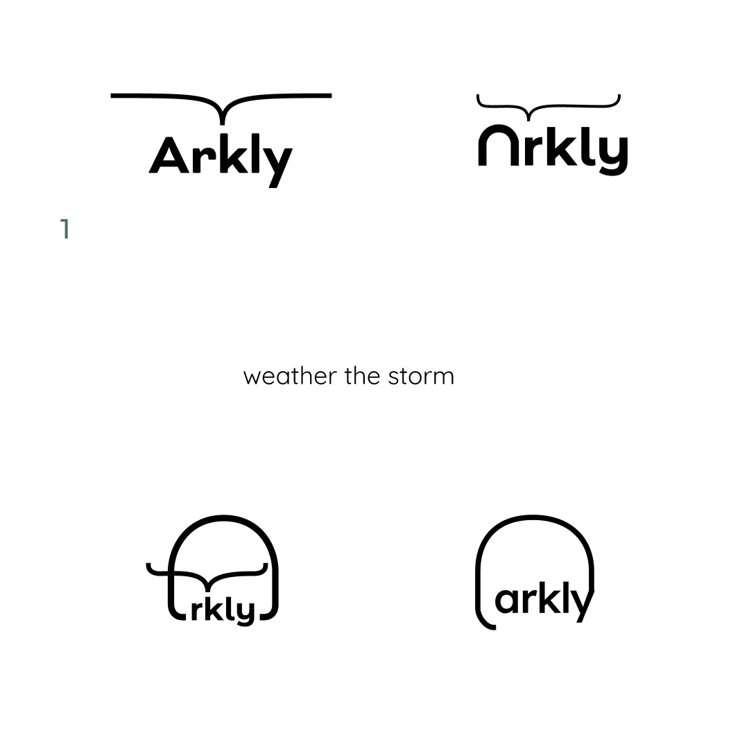
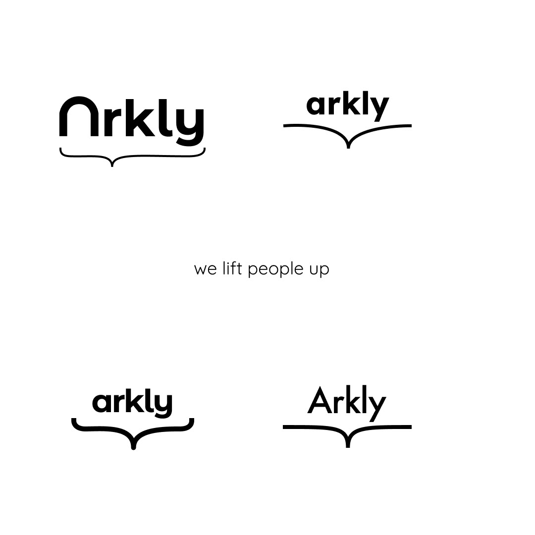
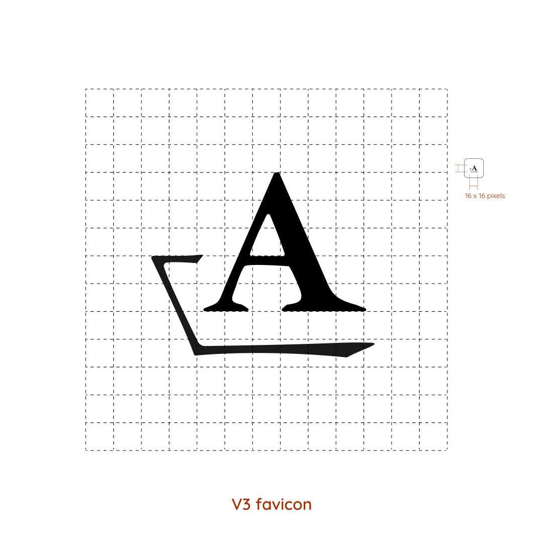
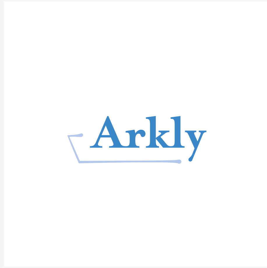
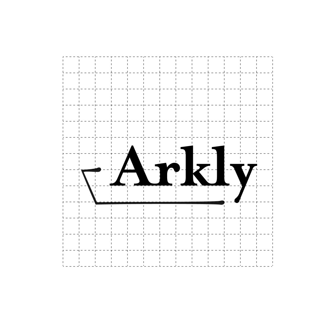
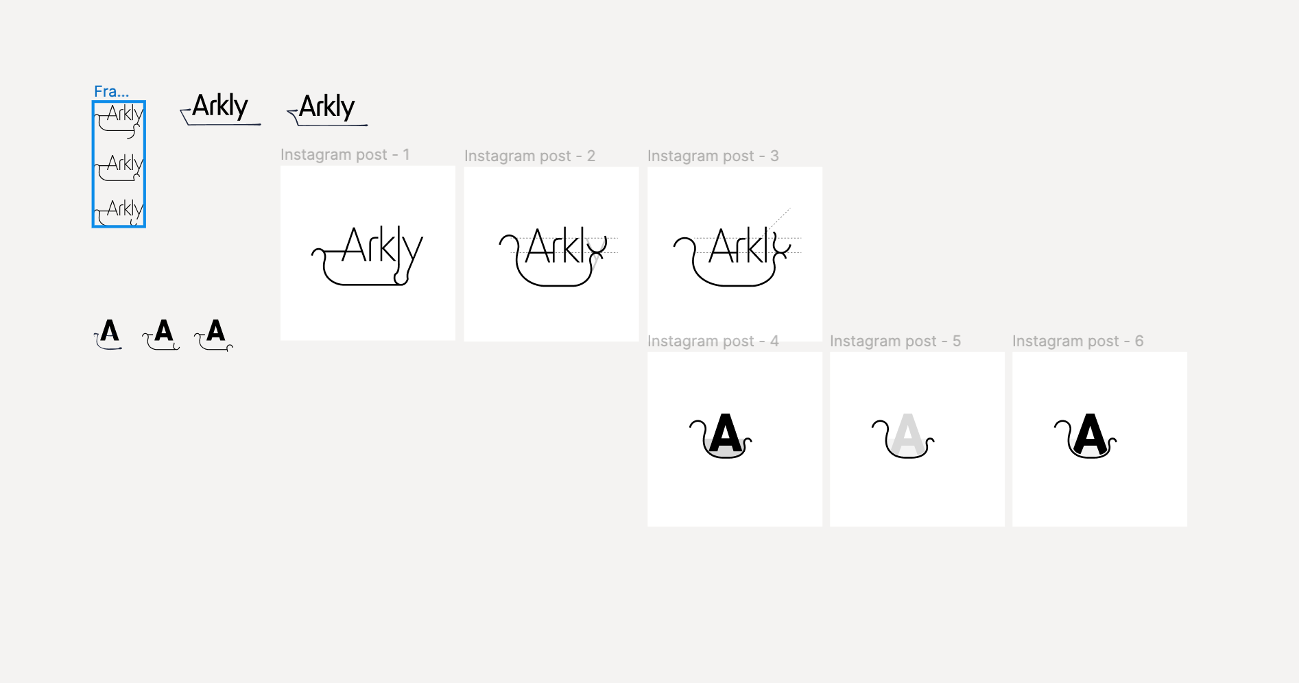
Brand Identity: Logo Design








~ (back to case study) ~
Discovery
Evaluation Heuristic
I wanted to understand more about the history of Hightide’s prior design decisions and processes. The team lacked an intermediary who could produce iterative designs between client, executive feedback, and developer.
To prove my cred to a team of engineer graduates. I identified areas to improve usability, learnability, consistency, user control and freedom in the existing Hightide software interface.
Competitor Analysis
RocketFlood
Information gathering survey uses delightful illustrations and simple process to collect accurate data from users during insurance quoting process
RiskFactor
T.O.C. navigation divides up complex information into approachable questions.
Google Maps
Map-first user interface, easy and simple side panel. Comfortable proportions.
Zillow
Purposeful navigation from homepage. All CTA’s direct to property map except for front and center for users looking to connect with agent to sell their home.
Findings
Easy, intuitive navigation through different levels of data
Intuitive, easy language. Clearly. understands their target audience in tone and value.
Risk ranking or scaled artifact giving users context and understanding of their level of risk in context to their local area.
Opportunities to create value, improve data accuracy, and future brand affiliations through different methods of gathering user property info through illustrated surveys, etc.
Target Audience
Middle-aged women (around 50) who are homeowners with families.
They prioritize their family's safety and are proactive in taking action.
They are active in their communities and use social media like Facebook.
They have limited time and prefer clear, concise information.
May need additional support like live chat or consultations.
Needs & Pain Points
Difficulty understanding flood risk and its potential impact.
Complexity of flood insurance options.
Need for actionable steps to mitigate flood risk.
Desire for information that is easy to share with friends and neighbors.
Design Solutions
Simple and intuitive UI:
Easy navigation, clear visuals, and minimal clicks to access key information.
Easy navigation, clear visuals, and minimal clicks to access key information.
Focus on map experience:
Leverage HighTide's existing strength in data visualization.
Leverage HighTide's existing strength in data visualization.
Data visualization:
Clearly communicate flood risk and cost impact on individual properties.
Clearly communicate flood risk and cost impact on individual properties.
Actionable steps:
Provide clear options for getting flood insurance quotes and connecting with experts.
Provide clear options for getting flood insurance quotes and connecting with experts.
Social sharing:
Encourage users to share information with their communities.
Encourage users to share information with their communities.
Mobile-first design:
Over 50% of users access information on mobile devices.
Over 50% of users access information on mobile devices.
Decision-making support:
Recommended options for flood insurance.
Live chat feature for quick questions.
Option to schedule expert consultations.
Design Priorities
Simple, intuitive, and user-friendly interface.
Clear and concise information with easy-to-understand language.
Accessible for older audiences with good typeface legibility.
Emphasis on map view with clear data visualization.
Seamless continuity between mobile and web experience.
Social media sharing capabilities.
Minimized jargon and focus on actionable data.
Options for live chat and expert consultations for additional support.
Development
"HighTide Intelligence had the pleasure of working with Tastemaker Studio on UX design for Arkly. Si\'s expertise helped to make a complex subject matter like flood risk simple. With tremendous work ethic, the studio delivered a beautiful design that perfectly captured our vision. We are thrilled with the end product, and highly recommend Tastemaker Studio to anyone looking for a skilled and dedicated UX designer."
Adrian Santiago-Tate, CEO of HighTide Intelligence


